


A certain type of watch is currently gaining a lot of online attention, and it looks remarkably simple. It doesn't feature a meteorite dial, hand-painted enamel miniature of a Japanese woodland, or a skeletal movement floating behind a sapphire bridge. Instead, it has a minimalist face, some indices, two or three hands, and ample negative space that can genuinely evoke emotion from a graphic designer. Watch enthusiasts often refer to these as "boring," usually while showcasing their more elaborate pieces on forums. Interestingly, this label isn't always intended as an insult; increasingly, it seems to serve as a badge of pride.
Lately, I've been contemplating this because I wear what many would consider an ordinary watch. Guilty as charged.
The current moment in watches is genuinely wild if you take a step back and look at it. Independent watchmakers are producing dials made from Detroit car factory floor paint scraping, aerospace-grade aluminum foam injected with resin, and yes, actual watermelons and monster faces, all in pursuit of novelty and the attention of a collector base that has grown deeply tired of being served the same rotating story about a new dial colorway. And honestly? Fair enough. There's real craft in that experimentation, and it's refreshing to see watchmaking get weird.
But here's where I start to diverge from the crowd.
The case for a complex, eye-catching dial is primarily that a watch should exhibit personality. The dial serves as a canvas, and a visually striking design signals taste and uniqueness. A brand director summed it up, saying that collectors are tired of conventional designs and seek something new. I completely agree with that point. However, I disagree with the implicit idea that a minimalist dial lacks a statement, when in fact, it can be a deliberate choice to make a subtle, sophisticated declaration.
A truly minimal dial is one of the hardest things to pull off well. When there's nothing to look at, everything is everything. The finish on the applied indices. The weight of the handset. The exact shade of the dial surface under different lighting conditions. Whether the proportions feel considered or accidental, there's nowhere to hide behind the interesting material. You start to notice things like how a brushed-steel dial shifts from warm champagne to flat matte depending on the angle, and how that quiet movement does all the communicating the dial needs to do. That's not a canvas being left blank. That's a different kind of craft.

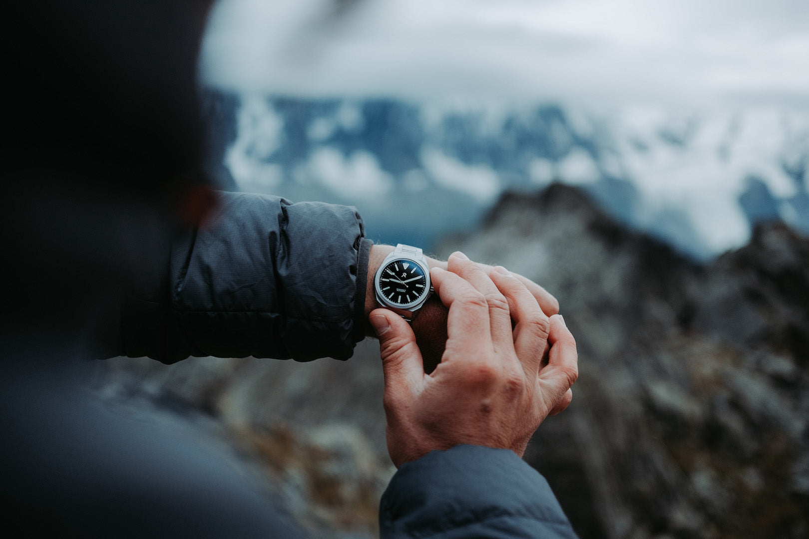
The watch I keep coming back to on the wrist is the RZE Resolute, and I'd be lying if I said I hadn't caught myself defending it in conversations with people who raise an eyebrow at how understated it looks. It doesn't have a story printed on the dial. It doesn't ask for attention. What it has is a titanium case that weighs almost nothing and handles genuine abuse without blinking, a dial so uncluttered it reads in half a second in any light, and a design language that looks the same whether I'm on a fire trail with red dust on everything or sitting across a table from someone in a decent restaurant. That versatility isn't a compromise. It's the point.
More collectors are arriving at the same conclusion: a clean three-hand dial does more work than a cluttered face full of functions that never get touched. There's a growing sense that the unique dial arms race has quietly overshot the brief. When every independent release is competing to be the most visually surprising thing in the room, the category starts to feel less like personal expression and more like a contest. The flashiest piece wins the photo, but it doesn't always win the day.
The tide is turning on what watch writers are calling the "look-at-me device," with more people saying goodbye to superfluous bells and whistles and maximalist combinations. That shift isn't happening because the watch community is getting boring. It's happening because a certain type of wearer has figured out that restraint is the harder flex to pull off.
The statement a minimal watch makes is quieter, but it's not smaller. It says, "I don't need the dial to do the talking." I know what this is, I know what it does, and I chose it anyway. There's a confidence in that which no meteorite dial, however beautiful, can replicate.
Boring, they keep calling it. I'll take it.


